There is a special honor in designing a custom identity typeface, for the leading visual identity conference, organized by the most popular visual identity publication. Our custom typeface Plumbago ties an event to its host city, combining local history and typographic experimentation.
Custom typeface for Brand New Conference
Conference identity in motion. Video: Brand New
A brand designer’s brand design

1872 streetcar at The Pioneer Memorial Museum, Salt Lake City, Utah. Photo: Brand New

Utah Central Depot mule-drawn streetcar in service in 1929. Photo: Utah State Historical Society
While scouting Salt Lake City for Brand New Conference 2024, Armin Vit and Bryony Gomez-Palacio stopped at The Pioneer Memorial Museum near the venue. There, they spotted an unconventional style of handpainted lettering on an 1870s streetcar, which they felt could provide a key visual hook for their identity design for the conference. They challenged XYZ Type to reinterpret this source into a digital typeface that could be used throughout the system.
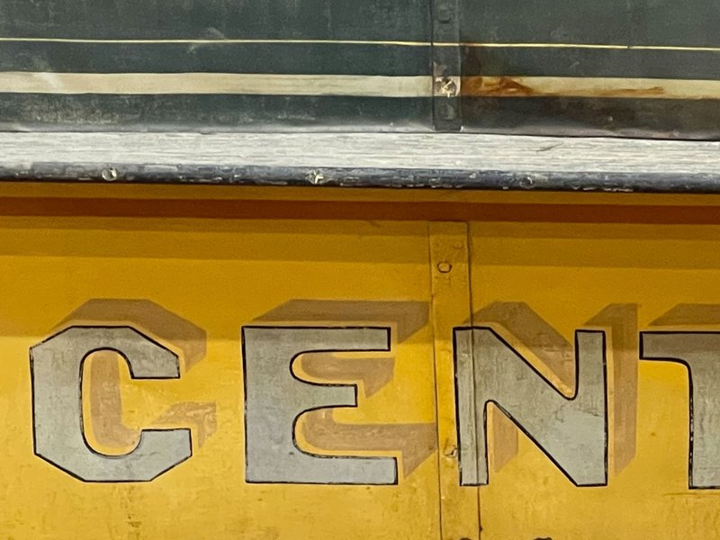
Lettering detail. Photo: Brand New
We are not type designers, so we knew we needed reinforcements. We’ve been fans of XYZ Type for some time, so we reached out to them to tackle the typeface.
UnderConsideration
Chris Skillern helped us with initial sketches, feeling out modes of expression that could capture the best qualities of the streetcar lettering. We wanted Plumbago to have the spirit of sign painting—dynamic and inconsistent—while working as a modern, optimized, digital font. After several tests, we leaned into strong octagonal silhouettes contrasting with teardrop-shaped counterforms, offset by moments of asymmetry and tapering terminals.

Reference material

Direct tracing

Initial exploration

Initial exploration

Initial exploration
The city grid
Salt Lake City adheres to a uniform grid of square city blocks, with streets running north-south and east-west. This gave the Brand New team another primary visual concept, building the identity around that same grid, tying the conference to its location. Baking this premise into the custom typeface itself, we made Plumbago a monospaced font, with every capital letter pushing to the edges of its square.
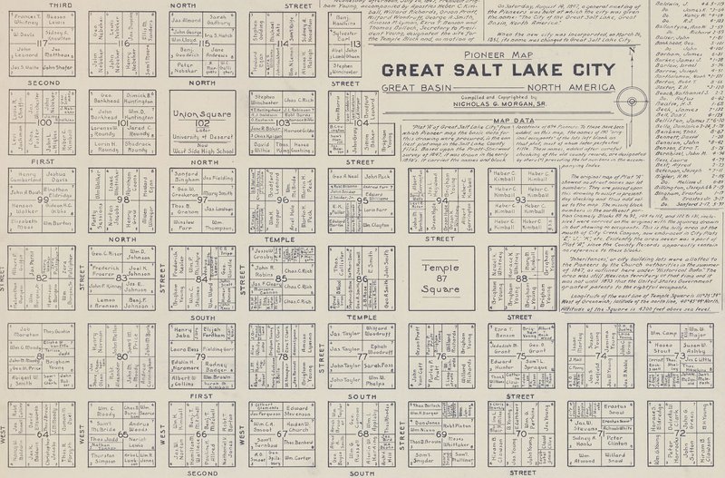
Map of Salt Lake City based on the Pratt-Sherwood survey of 1847. Photo: Beinecke Rare Book and Manuscript Library
We worked with Travis Kochel to expand the character set and find creative ways to fit the system onto the grid. He proposed a playful solution to the misalignment caused by justifying a monospaced font: extra-wide alternates could fill the empty spaces. The test was too visually dramatic for the conference’s identity system but led us to a subtler idea.

Exploration of extra-wide alternates

Exploration of extra-wide alternates

Exploration of extra-wide alternates
We added a few key alternates to rebalance combinations where a typically wide letter pairs with a typically narrow letter. For example, breaking out of the monospace rule by swapping a wider W next to a narrower I maintains the overall word length while giving the letterforms a more natural appearance. Bryony and Armin liked this idea, which we included as an optional OpenType feature in the custom typeface.

Plumbago with contextual widths

Plumbago without contextual widths

Plumbago with slab alternates

Plumbago without slab alternates
We also introduced alternates with slabs so that glyphs that carry a lot of empty space—like A, L, and T—can take up more of their allotted squares.
Variety inside the square
OpenType tricks aside, perhaps Plumbago’s most eye-catching feature is a striking contrast between its inner and outer forms, ovoid curves butting up against straight boundaries. The dynamic energy of this shape language plays on the steady rhythm of a monospaced typeface, giving the typeface freedom to adopt unconventional solutions in much of the extended character set.


Unexpected ingredients
Plumbago grew out of a unique collaboration with a trusting client who brought us an unconventional recipe for a typeface, making the 2024 event feel strongly planted in Salt Lake City. We can’t wait to see what big ideas Armin and Bryony bring to the stage with it.
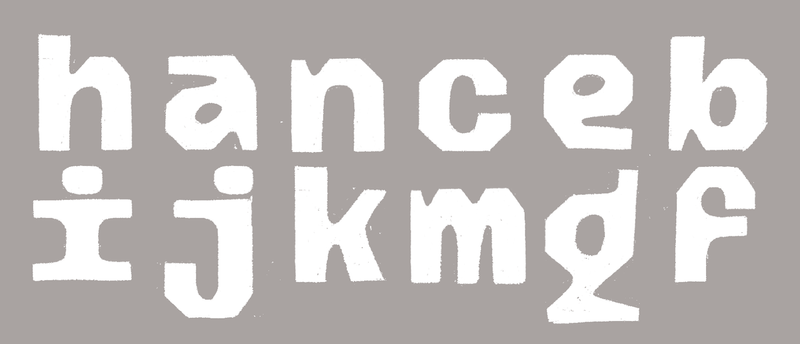
Zrinka Buljubašić’s early sketches for Plumbago’s lowercase
Plumbago is now publicly available for early access licensing. In the months leading up to the conference, we’ve upgraded the original custom typeface with a lowercase and a series of widths, the beginnings of an unconventional family that will continue to grow. As eclectic and specific as the ideas underlying this commission initially seemed, they turned out to be worth exploring even further.
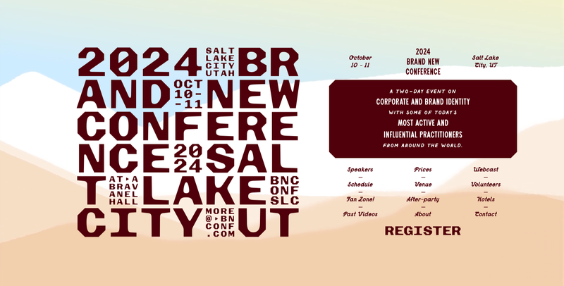
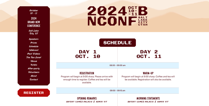
Plumbago in use on the Brand New Conference 2024 website
Further reading
2024 BNConf: About the identity (Brand New)