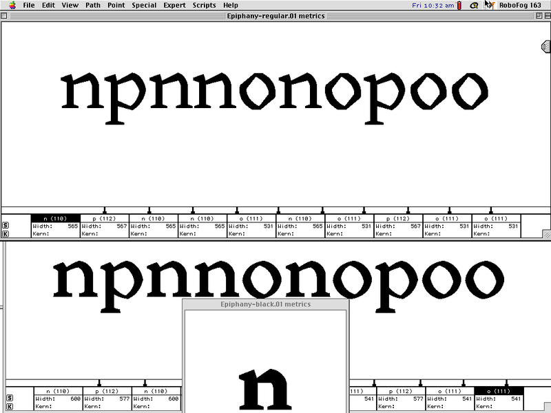
Cedar was my first serious effort at designing a typeface. As documentary proof, here’s a screenshot I took in March 2001, comparing two of my earliest sketches in Robofog on Mac OS 9.
I started the project as an undergraduate, in an independent study with Cyrus Highsmith. I’ll write more later about the origin of the idea and the internal logic of its execution.
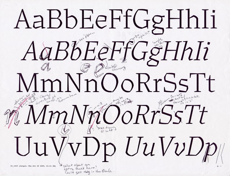
It can be tempting to romanticize the sometimes epic gestation period of a typeface (guilty!), but to be honest, Cedar’s growth was stunted by two decades of procrastination and self-doubt.
About once a year I’d dust off the files and rework, overwork, or completely reboot. But I was never satisfied with my solutions, and I’d ultimately put it back on the shelf. (I swear, I work about 100 times faster when a client is waiting for something.)
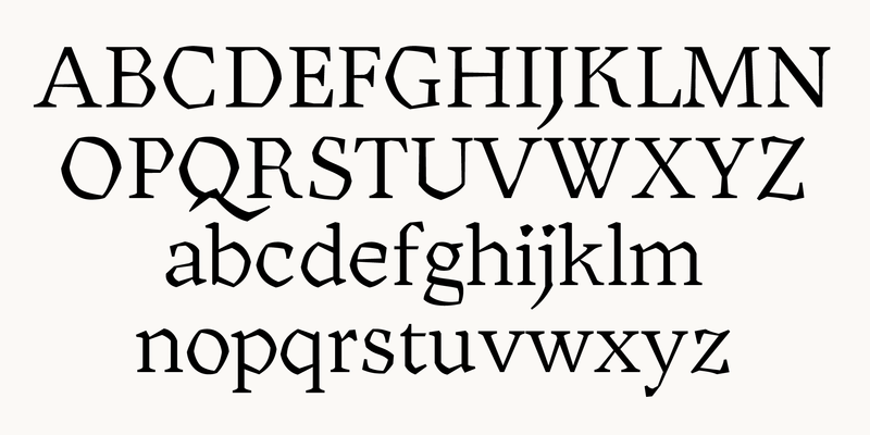
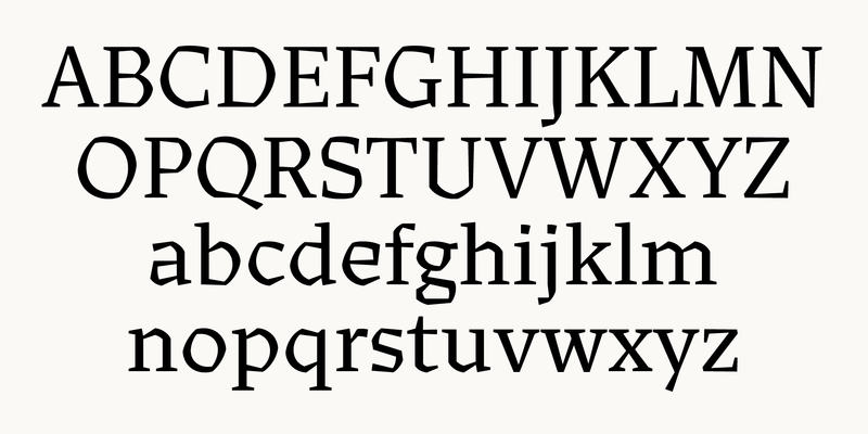
I’m back to work on Cedar with new momentum, and I plan to release frequent updates in the coming months as I get through them: additional weights, larger character sets, and Italics.
I’m excited—and a little nervous—to put unfinished work out into the world, but I would love to get your input on the design. I think Future Fonts will be the perfect nursery to see this little sapling to full maturity.