HashiCorp provides a range of ecosystems within digital infrastructure and security, helping organizations thrive in the cloud. That may sound complex, but at their core, all these things have much in common. And that’s exactly what this project was about—simplifying and unifying the visual representation of an extensive product range by developing a custom typeface.
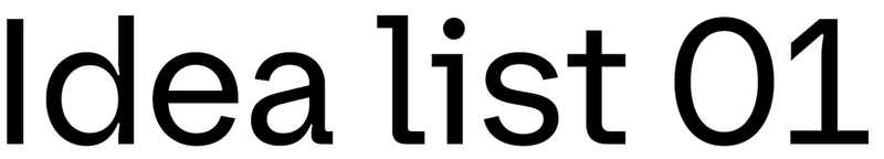
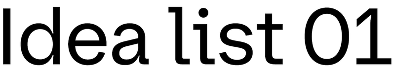
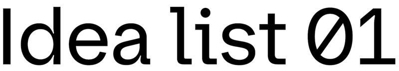
Custom typeface for HashiCorp
“Meet The Infrastructure Cloud” video by HashiCorp
Unification
We were drawn to XYZ Type’s inquisitive, process-driven approach. Rather than follow styles or trends, XYZ looks to the DNA of a brand and the history of its niche, then draws from its own deep knowledge of type design and history.
Coon Lam, Senior Director, HashiCorp Brand Studio
When HashiCorp approached us, their typographic voice was dominated by two sans serifs that refused to work together. Klavika, with its narrow set and straight sides, gave the primary logo and the wordmarks for their many products an outdated tech flavor. Cheerfully geometric Gilmer took on the headlines, causing hyphenation in frequent long words like “infrastructure.”
Before
After

Before

After
We worked closely with HashiCorp’s internal Brand Studio to replace both typefaces with something entirely new that would emphasize the trust HashiCorp had earned over a decade while maintaining its forward-thinking and approachable voice. Considering all the big and small design needs the team flagged, Ben and Jesse presented several potential concepts for the typeface. After discussing these extensively, we remixed them into a prototype font that we brought further into focus. We soon asked type designer Inga Plönnigs to build on that foundation and carry the design to completion—she excels at exactly the kind of clever systematic thinking this project demanded.
Based on my previous work, XYZ gave me creative freedom to bring my personality to the typeface they started. I found it interesting to balance unique character and neutrality, aligned with the client’s brand identity. I especially enjoyed finding a way to implement ink traps prominently without making everything revolve around them.
Inga Plönnigs, type designer

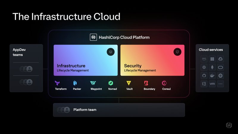
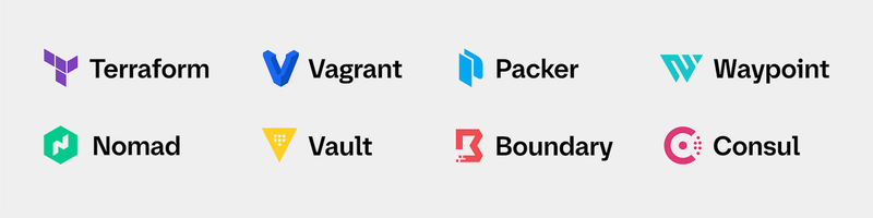
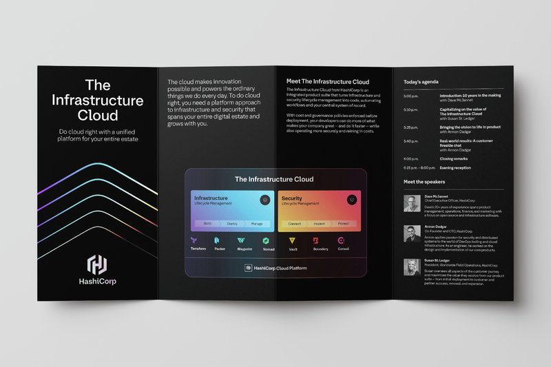
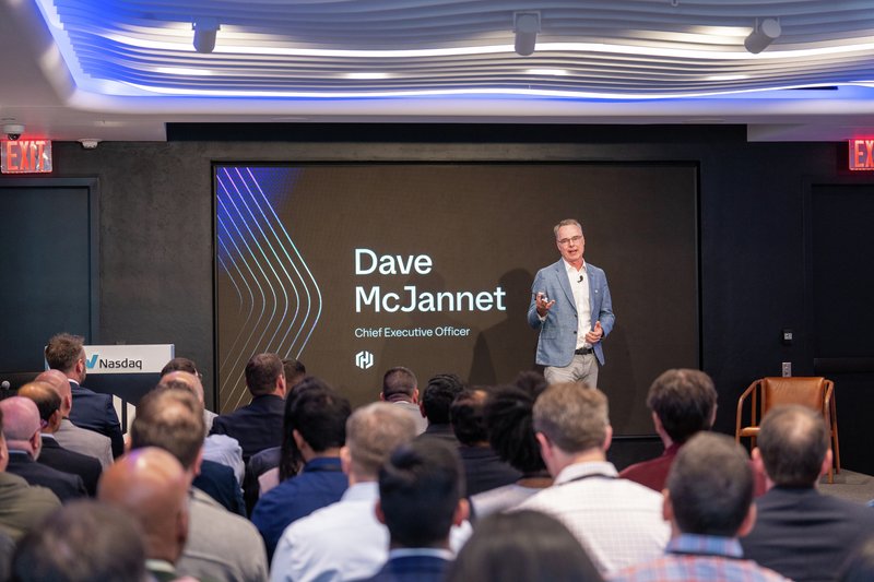
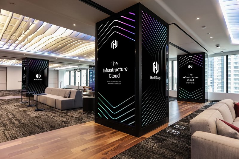
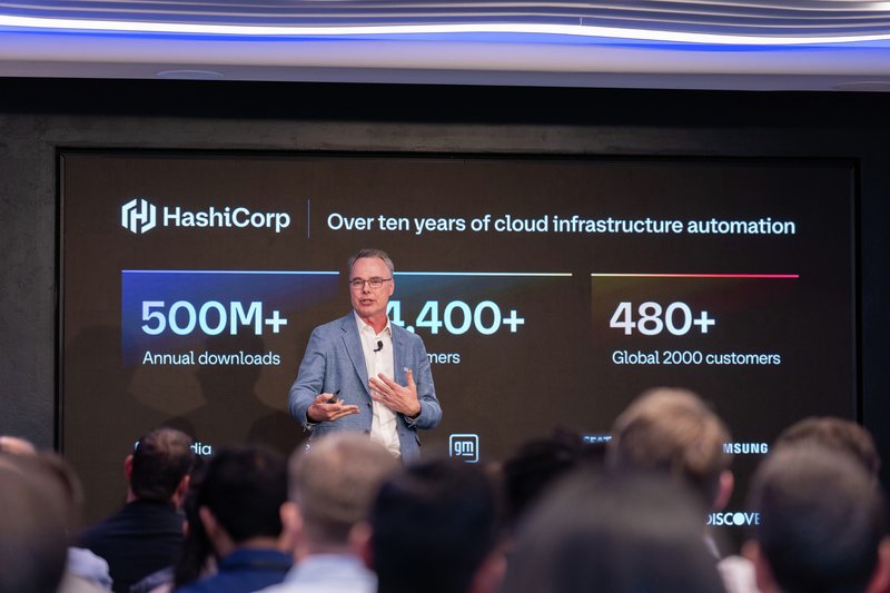
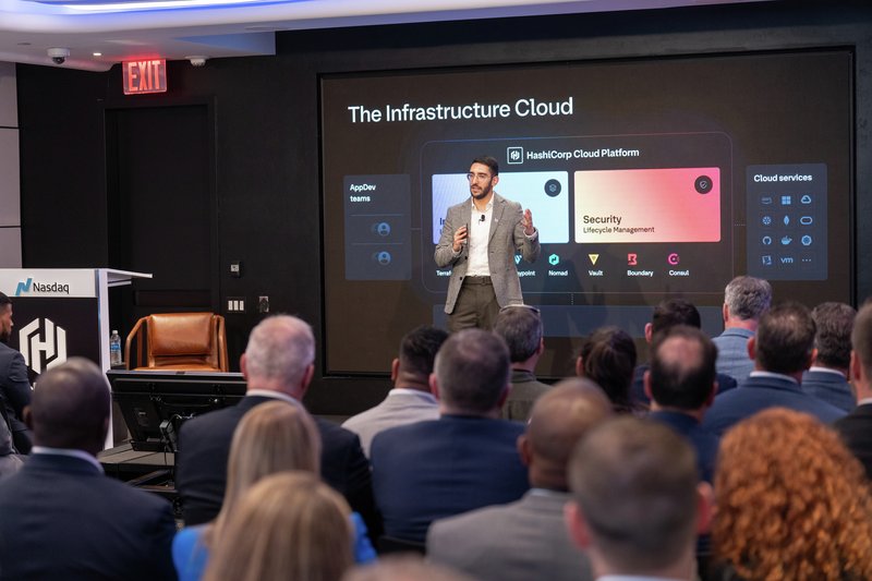
Slides from the announcement of The Infrastructure Cloud. Images: HashiCorp
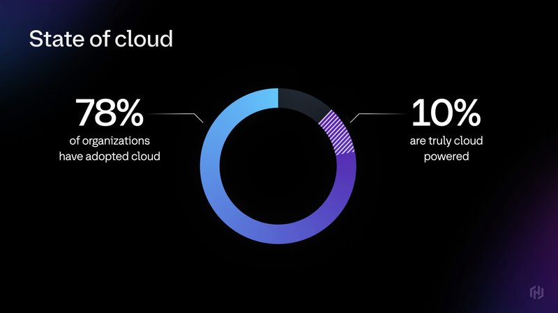
Slides from the announcement of The Infrastructure Cloud. Images: HashiCorp
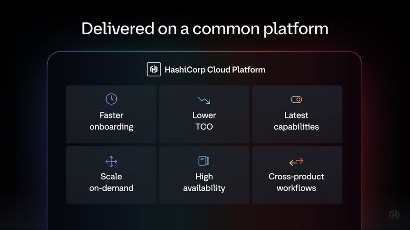
Slides from the announcement of The Infrastructure Cloud. Images: HashiCorp
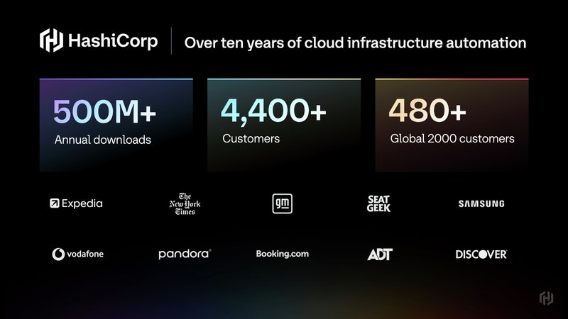
Slides from the announcement of The Infrastructure Cloud. Images: HashiCorp
Slides from the announcement of The Infrastructure Cloud. Images: HashiCorp
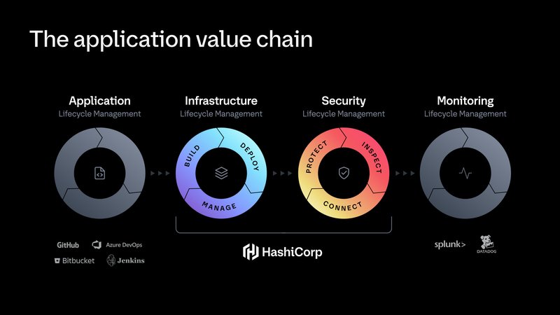
Slides from the announcement of The Infrastructure Cloud. Images: HashiCorp
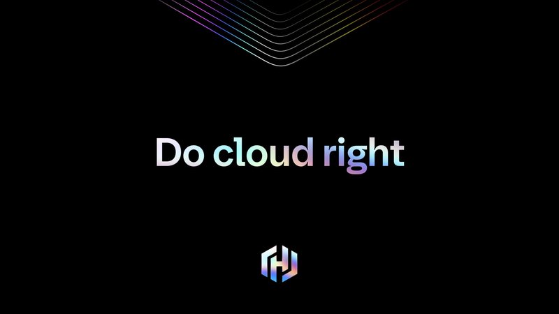
Slides from the announcement of The Infrastructure Cloud. Images: HashiCorp
System design, design system
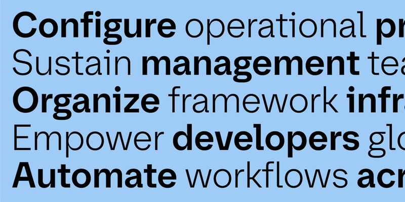
The typeface had many intended use cases: headlines, titles, and typical branding applications, combined with a series of logo lockups. Each sub-brand has a unique symbol, with the typeface bearing the weight of brand consistency. One important aesthetic puzzle to solve was bringing together two worlds: the digital and the organic, to reflect human interfacing with machine.
Sub-brand logos
Typography for HashiCorp initiatives
Typography for HashiCorp initiatives
Developer aesthetic
Deeply committed to their savvy community of early adopters, HashiCorp asked us to nod to the “developer aesthetic.” In the typographic vernacular: simple geometry works best for low-resolution displays, monospaced fonts are used for orderly lines of code, and strong distinctions between similar characters ensure clarity in programming (so that a 1 is not mistaken for an I or an l—you see what we mean).
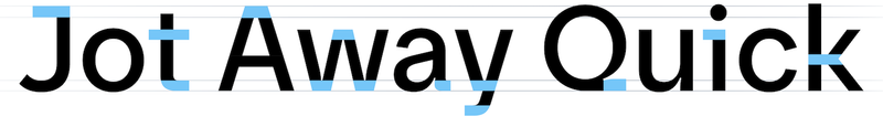
Our typeface design emphasizes geometry and horizontality on a relatively narrow set width. We made a playful design feature from the monospace convention of prominent in- and out-strokes on typically narrow letters like i, j, and l. Those letterforms also turn the idea of character differentiation into a strength rather than a bare need, and we included alternate glyph options for strategic use. (Notice that the primary logotype features an alternate i.)
Default
Alternate i
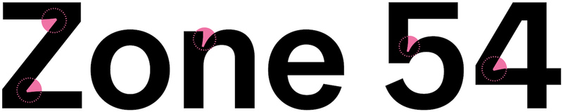
Slashed 0
Humanity
For the broad needs of a typeface with display and brand purposes, we borrowed from historical neogrotesques, using their rhythm and proportion for a more robust typographic expression. We balanced out the digital with the human by introducing looser, less robotic forms. For example, the terminals of curved strokes forego rigidity, as seen on G, a, and e. The angles are more natural, driven by the curvature rather than an underlying grid. The binocular g brings the type closer to calligraphic history, and the capital R’s bendy leg is simply having more fun.
Sparkle
We established a distinctive “ink trap” shape that sparkles where curves intersect with other shapes, a compelling, eye-catching moment of contrast and character. Although these cuts serve a technical purpose (alleviating unwanted visual density), we focused on how they serve a technical aesthetic: they are engineered shapes rather than places where two things merely join. They emphasize the precise nature of the typeface in a visually engaging way, and, as a treat, they also work for you when you don’t notice them.
Flow
From the start, we knew HashiCorp would retain its logo symbol, which provided a recognizable visual key. The prominent crossbar at the center of the symbol is reflected in the unexpected bridges at diagonal joins of A, k, w and y. The flat strokes of J, Q, a, i and t echo that horizontal movement, integrating a sense of flow into a cohesive visual language.
Fully developed
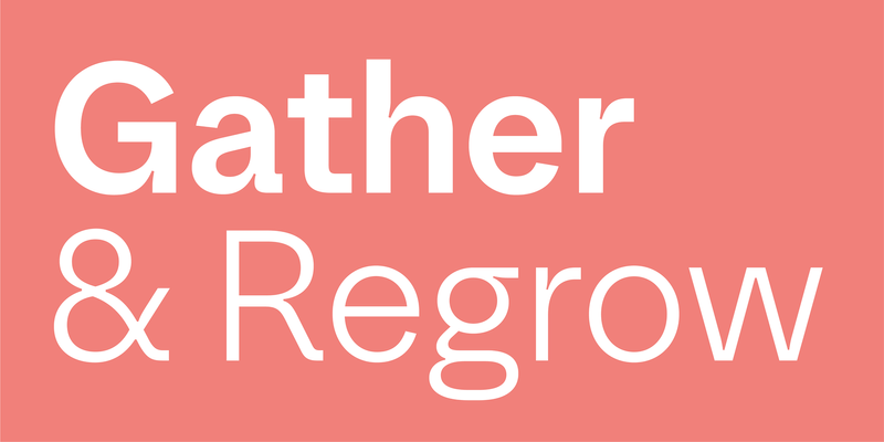
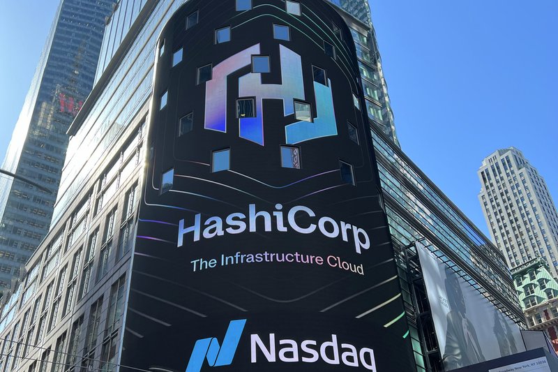
With the 2024 launch of The Infrastructure Cloud, a unified platform for their products, HashiCorp debuted a cohesive identity refresh that relies on their versatile new custom typeface to build visual consistency across wordmarks, headlines, and a wide range of other applications.
Type designers are the right people to talk to when it comes to the complexities that tech companies of this scale deal with on a day-to-day basis. At their core, fonts are spreadsheets filled with technical drawings, supplemented with code, user testing, and bug hunting. Embracing our affinity for systematic work and playful exploration, along with the client’s needs and ways of thinking, we imbued the very structure of the typeface with our own developer mindset.
Images: HashiCorp
Images: HashiCorp
Images: HashiCorp
Images: HashiCorp
Images: HashiCorp
Images: HashiCorp
Further reading
Introducing HashiCorp Sans (HashiCorp)