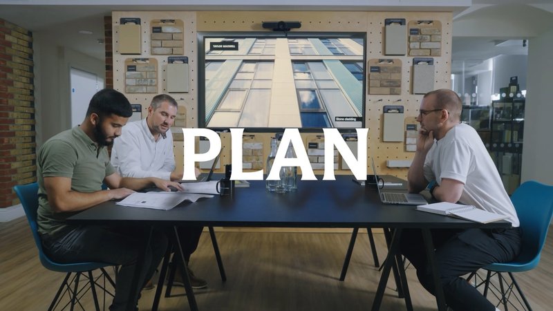
Sample uses of LSEG Motto from the identity system for LSE. Images: Interbrand
Sample uses of LSEG Motto from the identity system for LSE. Images: Interbrand
Sample uses of LSEG Motto from the identity system for LSE. Images: Interbrand
Sample uses of LSEG Motto from the identity system for LSE. Images: Interbrand
Just four letterforms—an L, S, E, and G designed for London Stock Exchange Group’s new identity—were the starting point for LSEG Motto, a custom typeface that highlights LSEG’s prominent position in the financial sector, visually unifying its growing portfolio of divisions, subsidiaries, and products, including London Stock Exchange itself.
Our frequent collaborator Interbrand asked us to help imagine lettering possibilities for LSEG’s new identity design. The brief was to emphasize the company’s history, its legacy of trust, and its vision for the digital future of finance.
LSEG Motto’s success was the result of XYZ Type’s attention to detail and care in bringing the idea of ‘modern heraldry’ to life for a global audience, balancing the timelessness of a 300-year-old company with the openness needed to accommodate five innovative sub-brands.
Mike Knaggs, executive creative director, Interbrand
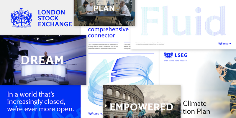
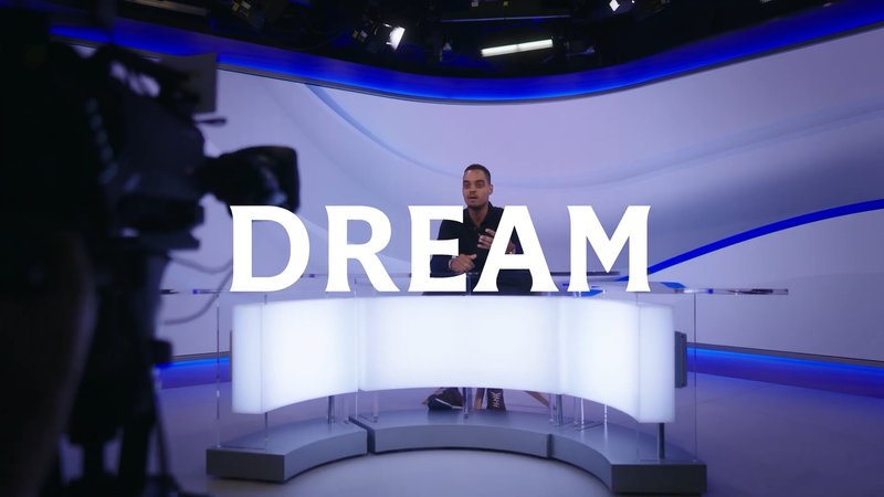
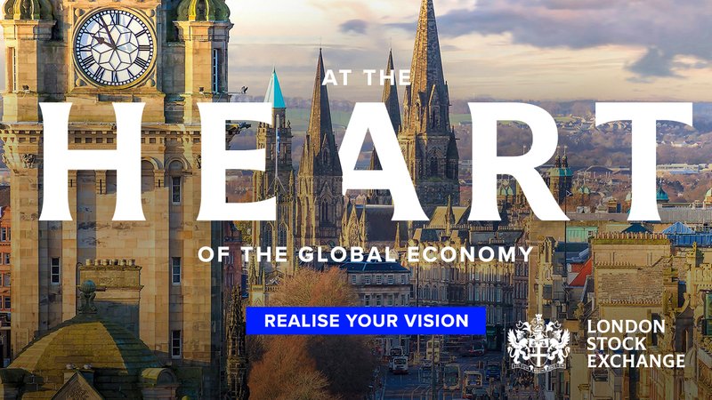
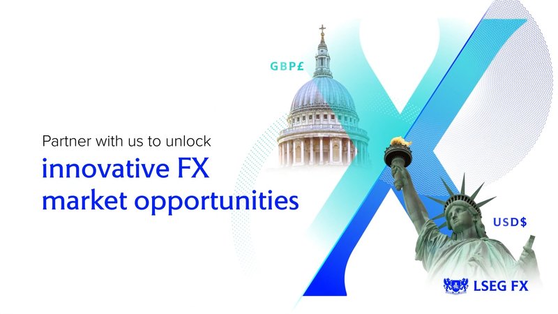
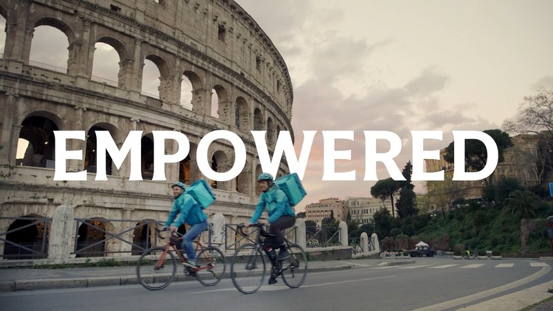
Sample uses of LSEG Motto from the identity systems for LSEG, LSE, LCH, and FX. Images: Interbrand and LSEG
Starting with just four letters
London Stock Exchange’s coat of arms, granted in 1923, is a core element of its visual identity. It includes a Latin motto, “Dictum meum pactum”—“Our word is our bond.” The lettering of the motto, in a hand-rendered version of Berthold Wolpe’s iconic British typeface Albertus, informed the overall tone of the new LSEG logotype, while the unconventional crossbar of the G was a nod to English lettering artist Michael Harvey.
Working closely with Interbrand creative director Mike Knaggs under the direction of LSEG’s brand strategy team, Jesse drew four letterforms in a stately flared sans serif style that would be the typographic signature of the new identity system. This lettering work was so well received by the LSEG team that Interbrand recommended expanding it into a typeface that could be used for all the brands under the LSEG umbrella.
Sample uses of LSEG Motto from the identity systems for LSEG, LSE, LCH, and FX. Images: Interbrand and LSEG
Sample uses of LSEG Motto from the identity systems for LSEG, LSE, LCH, and FX. Images: Interbrand and LSEG
Sample uses of LSEG Motto from the identity systems for LSEG, LSE, LCH, and FX. Images: Interbrand and LSEG
Sample uses of LSEG Motto from the identity systems for LSEG, LSE, LCH, and FX. Images: Interbrand and LSEG
Sample uses of LSEG Motto from the identity systems for LSEG, LSE, LCH, and FX. Images: Interbrand and LSEG
Research, absorb, synthesize
With Chris Skillern’s help, Jesse worked on expanding the logotype into LSEG Motto. In our initial research phase, we immersed ourselves in quintessentially British letterforms, including the ubiquitous blue English heritage plaques, Edward Johnston’s London Underground type, and George Mansell’s lettering for the University of London. With these visual references in hand, we set about designing something entirely original and unique for LSEG.
In the logotype, the L, S, E, and G were given equal presence, with minimal variation in width. This set the tone for the other capitals in the new alphabet: the relatively wide J, for example, and the narrow M, with its high midpoint. For the lowercase, says Jesse, the goal was to “complement the design of the capital letters, match the tone and values of the brand, and expand the aesthetic vocabulary of the identity system.”
LSEG Motto plays off the conventions of serif and sans letterforms; structurally, it’s a geometric sans, but many of its details recall the calligraphic flourishes of traditional serif typefaces. The stem of the t is in a decidedly sans-serif idiom, while an unconventional calligraphic spur takes the place of a crossbar on the left side of the f and t. The inflated, almost buoyant bowls of the a and b are offset by playful moments like the subtle flick of the g’s ear.
In the italic lowercase, these details are even more exaggerated. Meanwhile, smoother transitions in letters like n and p soften the skewed-roman structure, italic exit strokes suggest the movement of a pen, and the v, w, and y featurecurled upstrokes. The overall effect is a brisk rhythm of angles and curves, giving the typeface a sense of movement and friendly energy.
Our continuing partnership with XYZ Type always comes back to their high craft, creative vision, and ability to express our clients’ strategic objectives through world-class typography.
Mike Knaggs
Words to live by
With five roman and italic weights, LSEG Motto is a key component of a strong, flexible typographic identity rooted in LSEG’s history, establishing a visual consistency for the company that carries across its sub-brands, underscoring LSEG’s legacy of trust, vision for the future, and dedication to its motto, “Our word is our bond.”
LSEG Motto includes five weights in roman and italic.
LSEG Motto includes five weights in roman and italic.
LSEG Motto includes five weights in roman and italic.