New York magazine’s iconic display type has been part of its visual DNA since Milton Glaser first chose Photo-Lettering’s interpretation of Egyptienne Bold Condensed in the 1960s. Over time, the unmistakable, chunky slab serif has become a visual voice of New York City itself. But for the magazine’s designers who worked with it every day, the charm of the typeface came with compromises.
Custom typeface for New York magazine
Brand new app, brand new typeface
Legacy meets a limit
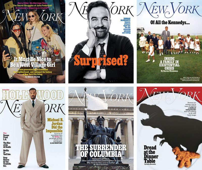
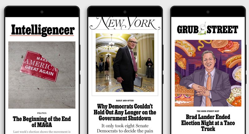
Covers featuring the new typeface
For decades, the magazine had relied on an early digital interpretation of Egyptienne, with inconsistent spacing and kerning, major weight imbalances, poor vector drafting, and a limited character set. It was difficult to read at small sizes, it lacked an italic, and many important glyphs were nearly unusable. Over time, the magazine’s staff had developed a patchwork of workarounds, even switching fonts entirely when setting certain symbols. These signs pointed to a deeper issue: a typeface that had outlived its utility, and one that was never truly optimized for digital use.
“The caps were super heavy compared to the lowercase,” said Ian Adelman, chief experience officer at Vox Media, who oversaw the project. “It just felt kind of glaring—like if you had a capital M, it dominated everything.”
Print designers could massage layouts manually, but on the web and in the app, it was a different story. Eventually, workflow delays and legibility challenges demanded an intervention.


A worthy update to a quintessential aesthetic
When the magazine approached us, it wasn’t our first time working with the team. In 2018, Ben designed a super-compressed version of Egyptienne for their 50th anniversary issue—a project that gave us a head start in understanding their tone, workflow, and needs.
The new commission, however, was much broader in scope. The magazine needed a typeface that would perform better in small sizes for the upcoming relaunch of their app. But we saw an opportunity to give them something much more robust: a versatile, variable type family tailored to their entire ecosystem. The goal wasn’t to reinvent, but to retain its iconic look while solving years of accumulated friction.

The two extremes of the optical size axis, Banner for large sizes (top) and Rubric for small (bottom), include optical adjustments to letterspacing and internal negative spaces.
Our designers, Ben and Zrinka, collaborated on the new commission, with some outside design assistance from Robin Mientjes, focusing on core features to shape the foundation for a contemporary interpretation of Egyptienne:
Rendering signature typographic quirks with confident vector curves
A true italic, created from scratch with no precedent
Optical sizes on a variable font axis, ensuring legibility in all of the magazine’s anticipated applications—both print and digital
Thoughtful design for previously-overlooked glyphs like the ampersand, currency symbols, and punctuation
Contextual alternates to improve spacing and layout across platforms
Rather than basing our work on the previous digital version, we took inspiration from Schelter & Giesecke’s Halbfette Egyptienne (circa 1880), selectively modernizing certain details along the way, tailored to the magazine’s preferences and usage.

Before

After
A focus on italics
For the new italic, we collaborated with the magazine to expand the visual language, while respecting the original aesthetic that readers had come to expect.
Thomas Alberty, design director for the magazine, noted: “The italic had to be usable—not so fussy or so different that it felt foreign to readers.”

The new italic
With no original italic to reference, Zrinka looked to other slab serifs from the same historical period, building a set of rules and gestures that could coexist with the Roman. The result is a hybrid between cursive and oblique; some characters are more decorative, others are more simple and blunt. The team considered multiple versions of key letters—such as the a, v, and g—before settling on a system that felt elegant, expressive, and honored the original aesthetic.
The new italic gives the magazine the typographic tools it has long lacked, along with a whole new expressive voice.

Our italic

Our italic, with alternate a and g
From workarounds to workhorse
The new typeface smoothed out decades of inefficiencies. Manual tweaks, kludgy workarounds, and visual inconsistencies across platforms were replaced by a coherent, polished system.
Now, contextual alternates handle tricky kerning combinations, and the optical sizing axis means the same font could serve both high-impact headlines and tiny footnotes — no more switching fonts for special characters. Finally, the new typeface brings much-needed balance between uppercase and lowercase.
We hired pros and let them do what they do. We dropped the new typeface in with zero issues—that’s a huge deal—and the whole magazine just looks more cared for.
Ian Adelman, chief experience officer at Vox Media
Reaffirming the iconic New York look
Our work with New York went beyond historical restoration—it continues a storied design lineage with fresh thinking. We honored the spirit of the original while extending it, refining it, and making it speak more clearly in today’s media landscape.
“It's quirky and chunky in its own way,” said Thomas. “It has charm.”
The new typeface carries the brand’s legacy forward and reaffirms the magazine’s identity with new tools for the future.
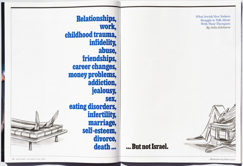
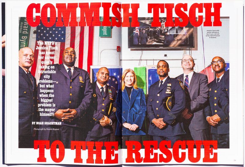
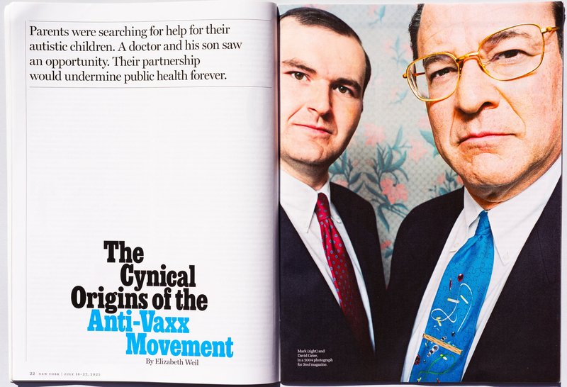
Details of the typeface in use
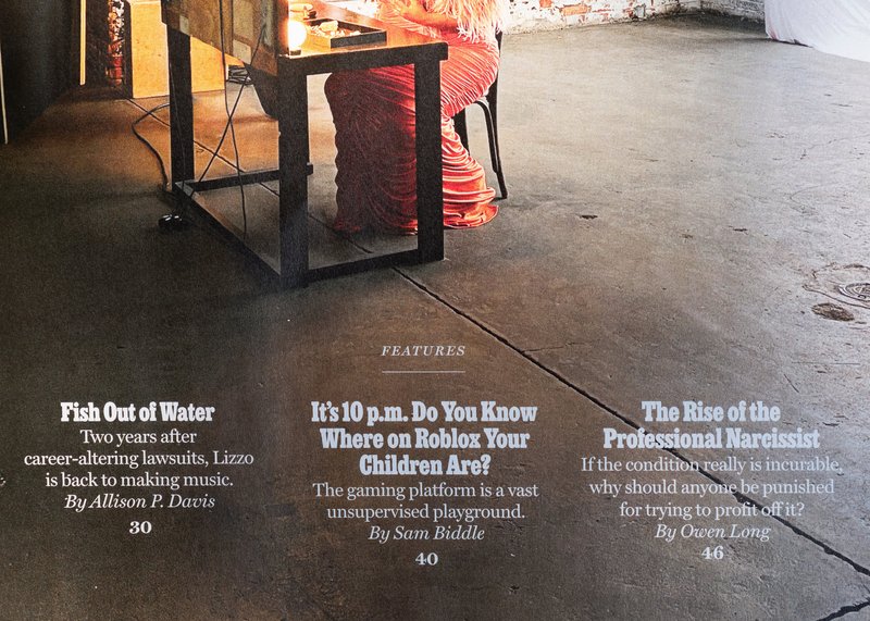
Details of the typeface in use

Details of the typeface in use

Details of the typeface in use