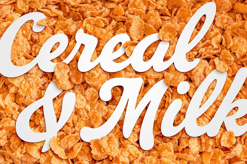
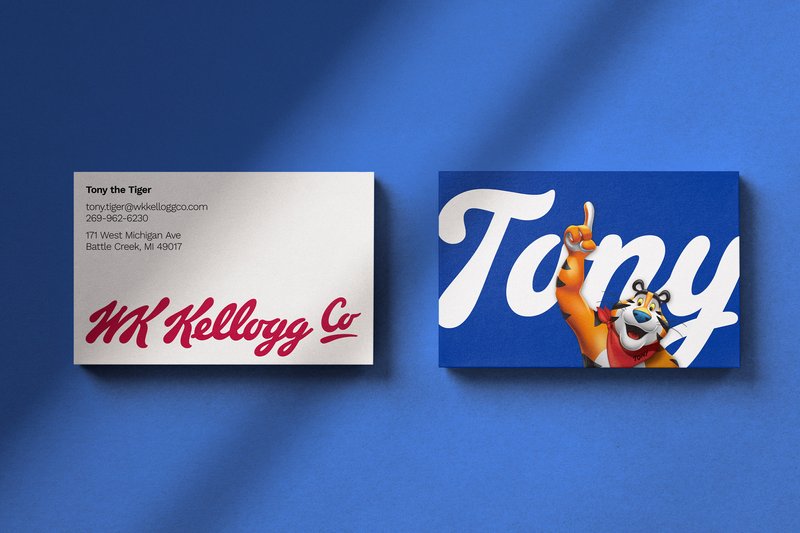
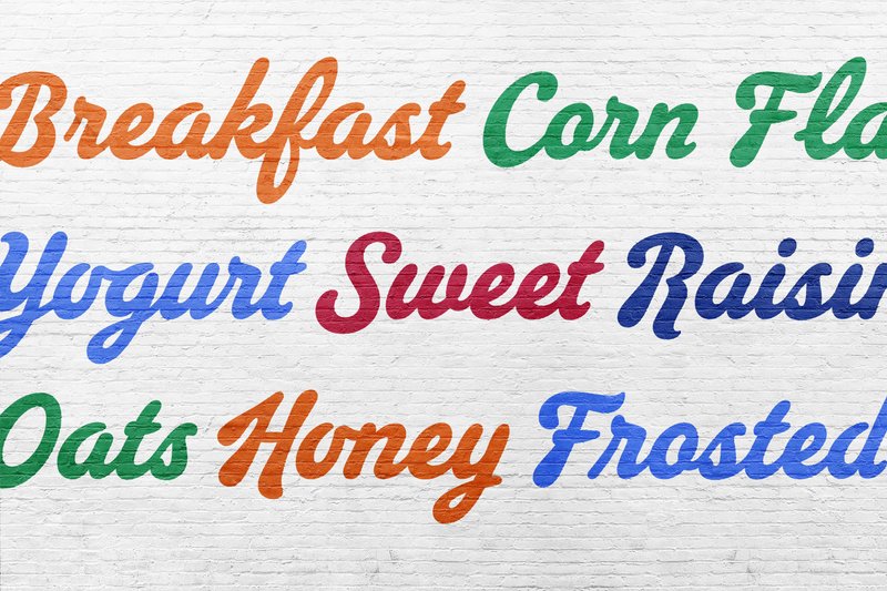
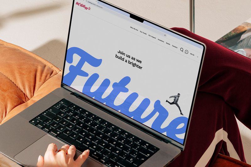
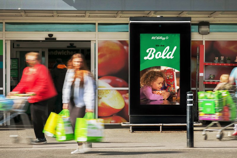
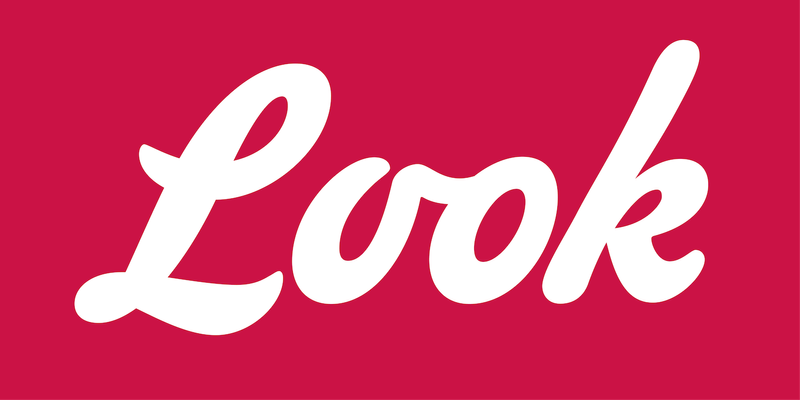
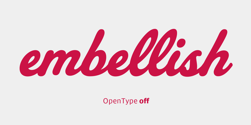
Sample uses of WK Kellogg Script. Image: Brunswick Group
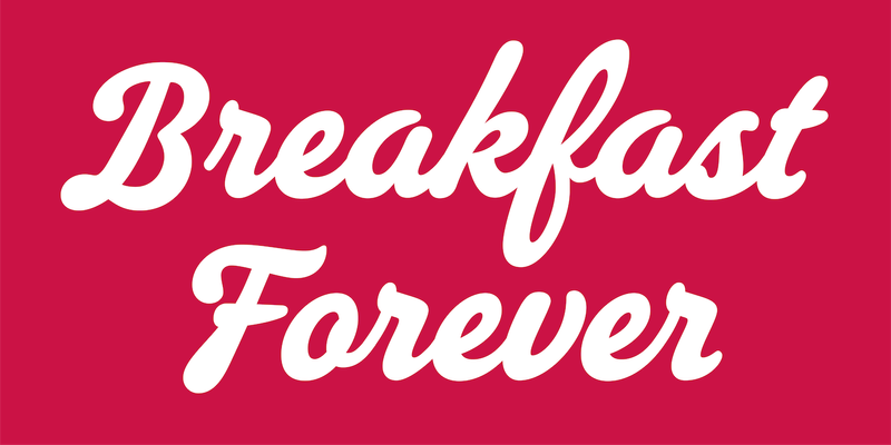
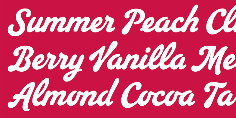
Sample uses of WK Kellogg Script. Image: Brunswick Group
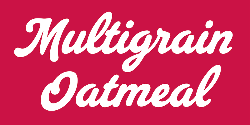
Sample uses of WK Kellogg Script. Image: Brunswick Group
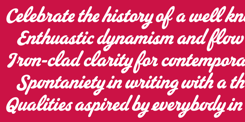
Sample uses of WK Kellogg Script. Photo: Brunswick Group
Sample uses of WK Kellogg Script. Photo: Brunswick Group
A brand-new typeface that’s “always existed”
Kellogg Company’s separation into two independent, public companies—Kellanova, a global, snacks-led powerhouse, and WK Kellogg Co, a North American food company focused on cereal—was an opportunity to define the new logo and design a proprietary typeface for WK Kellogg Co that would draw upon the deep history of a celebrated brand.
The new identity for WK Kellogg Co honors the entrepreneurial spirit of founder, Will Keith Kellogg, while elevating the company to new heights. Working with Kellogg Company on the new systems, Harlie Brindak, creative director at leading critical issues firm Brunswick, envisioned creating a working font for WK Kellogg Co’s corporate communications based on its founder’s iconic signature to infuse his entrepreneurial spirit into every aspect of the new identity.
XYZ was an incredible partner throughout this process. In this particular case, we were working from a singular point of reference, and a globally recognized one at that: the current Kellogg’s logo. And while it’s distinctive, there was much to be defined for the typeface. Through their research, imagination, and skill, they were able to build a completely natural and beautiful script that feels as though it’s always existed. I can’t thank them enough.
Brunswick Creative had been working with XYZ Type’s Ben Kiel on refining the final lettering for the new WK Kellogg Co logo, so Harlie asked us to design a script typeface that would feel like its long-established counterpart. With its well-known K and flowing lowercase, the logo would be a perfect starting point, but it wasn’t as simple as drawing letterforms that resembled the logo.
Conveying the essence of a logo
For this project, we collaborated with Rodrigo Saiani at Plau, a Type Network partner foundry. His fresh perspective, experience with script lettering, and endless enthusiasm were indispensable. Together, we researched the history of Kellogg’s packaging and advertising, cross-referencing it with lettering and sign-painting manuals from the early 20th century, when the original logo was created. “After hours searching through treasure troves of vintage lettering for clues to the project’s toughest challenges,” Rodrigo recalls, “we put pencil to paper.” Ben and Jesse then worked in close collaboration to choose hand-drawn sketches that matched the feeling of the logo but would be legible as stand-alone letterforms.
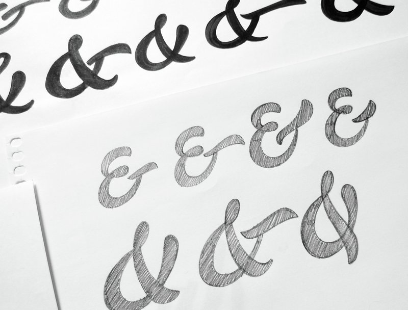
Initial sketches by Mariana Navarro of Plau
How do you expand a classic logo’s limited vocabulary of structures into a more diverse collection of letters, but still preserve its essence? This was the biggest challenge of the project. It took a great deal of back-and-forth to match the capital letters to the dramatic Kellogg’s K, then figure out a lower case that would maintain that dynamism without being too distracting.
Pinch me. That was my first thought when I was invited to work alongside Ben and Jesse to create a typeface based on one of the most iconic logos in history. Typefaces that want to be seen and felt, not just read, always spark my interest. Being able to collaborate with and learn from designers I look up to and respect so much was a big bonus.
Rodrigo Saiani, Plau
Time lapse of sketches by Rodrigo Saiani
Walking the tightrope of legibility
Designing a steady, highly legible typeface called for many small decisions from our team. One key early decision was to reduce the K’s unusually steep incline for a better fit between capitals and lower case.
Making an I or a J identifiable in a script typeface is no small feat, and this is where research into old sign-painting manuals paid off, inspiring a variety of options that Brunswick Creative tested live in their working files. To improve letter recognition, we decided against a cursive structure for the Q, F, and T. “We wanted shapes that felt authentic to the era,” says Jesse, “but a contemporary audience would find many of those old-fashioned script structures less than legible. We needed iron-clad clarity.”
Working in the real world
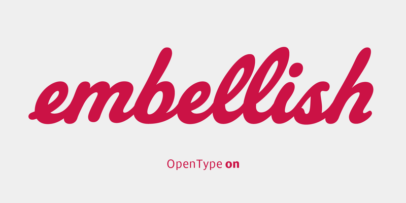
We standardized the relationships between letterforms to make them work within the confines of a digital font. The exit stroke of each letter connects to the next in a consistent and pleasing way, and OpenType contextual alternates allow glyphs to be automatically substituted at the beginning, middle, or end of a word, producing a more natural effect, closer to hand-drawn lettering. Special glyphs like the stair-step ll and the e with an entry stroke match the spontaneity of the logo.
But this typeface was meant for business communication, so we had to ensure the font files would be bulletproof even without these bells and whistles. PowerPoint, for example—everyone’s favorite presentation software—lacks the support for OpenType features that many script fonts depend upon. “Our goal,” says Ben, “was for the default characters to work really well without any fancy OpenType features. Then we could build extras on top of that base to make it work even better.”
Thinking outside the cereal box
The historical Kellogg’s logo is full of flavor and personality, starting life as W.K. Kellogg’s signature and evolving over time into an icon of Americana. But when we set about designing a full typeface, the logo could only provide a point of departure. Rodrigo, who helped us close that gap, reflects on our work: “The kid who loved Sucrilhos” (as Frosted Flakes cereal is known in Brazil) “would be so proud that my letters are making their way into cereal history.”
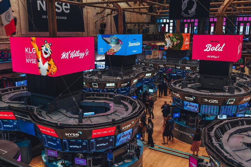
WK Kellogg Co logotype and custom typeface on the floor of the NYSE on listing day for WK Kellogg Co