Schelter & Giesecke’s Halbfette Egyptienne, the basis for Ballast
I am always thankful when a client typeface design project comes my way; though sometimes stressful, I really enjoy the challenge. Without a client, I spend far too long in the weeds on a typeface, moving at a snail’s pace toward finishing it. Deadlines snap me out of overthinking and into making.
In 2013, Christian Schwartz of Commercial Type asked me to help propose a suite of typefaces for New York magazine. The magazine prominently uses Egyptienne, a digital font likely based on the Dutch type foundry Tetterode’s Egyptienne (circa 1900), which itself is a copy of a typeface by Schelter & Giesecke (circa 1880). We decided to base our design on that earliest version.
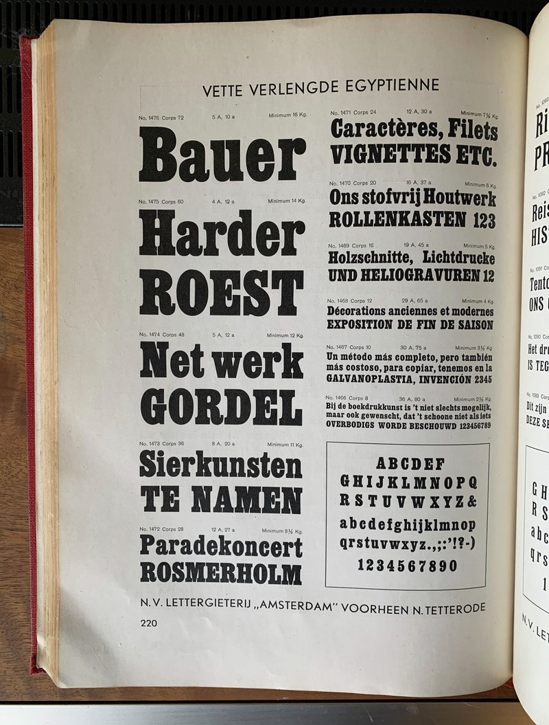
Tetterode’s Vette Verlengde Egyptienne from the early 20th century. Photo: Jackson Cavanaugh
The sharpness and charm of the German original was lost in the Dutch version (particularly in the ball terminals) and even more so in its digitization. Our project aimed to bring back the crispness of the original, so that the typeface would hold up better on screen and print. Like some client projects, this one stayed in the proposal stage for a long time, until a bit of it was brought to life for the 50th Anniversary issue of New York.
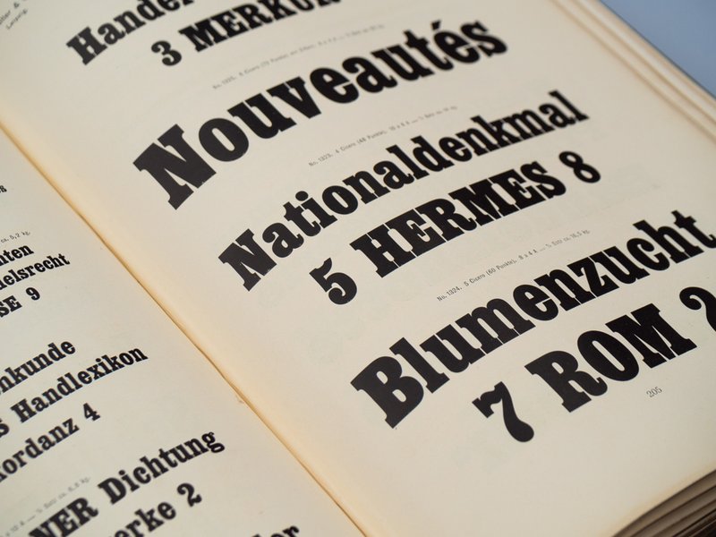
Photo-Lettering’s version of the design, used by New York magazine in the 1970s
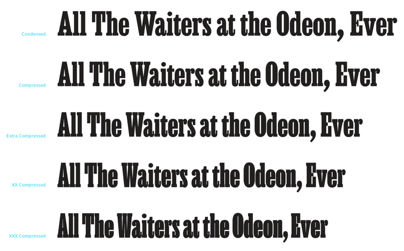
Unlike the initial pitch to the magazine, the design became much narrower (in fact, there were even narrower versions proposed, see below).
Because the new typeface would be used alongside the other digital version of Egyptienne already in use, it didn't stray too far from the models laid down by Tetterode and Schelter & Giesecke.
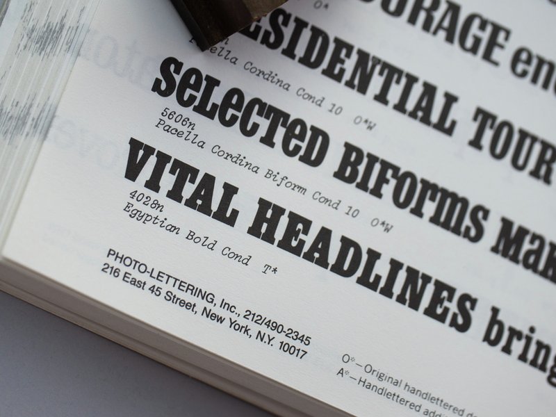
New York magazine version of Ballast (then Egyptienne Compressed), commissioned by Tom Alberty and Chris Cristiano
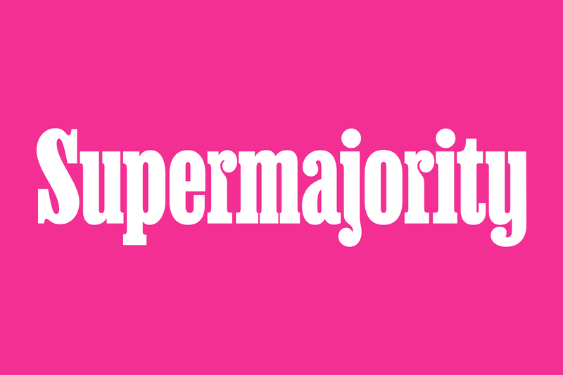
Supermajority logotype
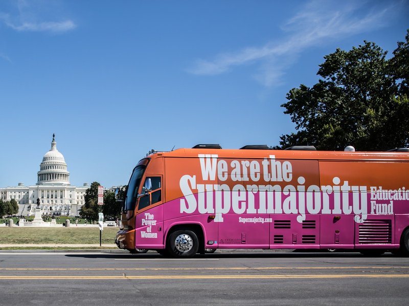
After that initial use, the typeface sat idle while other projects took priority at XYZ Type, but we quietly offered it for licensing if someone wanted to use it. Then Champions Design commissioned a customization of the typeface for the identity system of Supermajority.
Jennifer Kinon and Bobby Martin of Champions Design are dream clients. They know what they want, articulate it well, and trust you to bring something to the table. Jennifer encouraged me to make as little negative space inside of the Supermajority logo as possible. This led me to see what would happen if I started pushing the chunky ball terminals into the stems of letters.
Application of the Supermajority custom logotype and customized typeface—on a bus!
There was some precedent in the original source material for this treatment, specifically in the j, but Jennifer encouraged me to take that strategy much further. You can see it most in the r and—my favorite—the g.
For this release, I’ve taken those ideas a bit further, making myself at times uncomfortable, but also giddy with how quirky the design is becoming. I’ve always loved slab serifs, the chunkier the better, so this has been a fun idea to play with. I liken it to the solutions one comes up with when printing with wood type; half the fun is figuring out what to do when you find yourself missing a letter—sometimes what feels wrong is actually better than alright.
SF NM Riso print
Jesse and I asked Kevin McCoy of Work/Play to make some interesting visuals to show off Ballast for the release on Future Fonts. Kevin went to town, designing a zine (Risograph-printed by Riso Hell) inspired by his residency in Santa Fe, New Mexico.
Due to an unexpected trip out of town by the printer, Kevin used an earlier version than the typeface released as v0.1. The rushed press deadline forced me off the fence in choosing the name Ballast, as I had just one morning to make the final choice!
SF NM designed by Work/Play for the initial release of Ballast
Thank you
As with any project, many thanks are to be given: first to Christian Schwartz for starting this project, to all our clients for using the pre-Future Fonts betas, to Jesse Ragan for being my best critic, to Kevin McCoy for gracefully dealing with unexpected deadlines while making Ballast look great, and to my family for dealing with dad disappearing into the office to get things finished.