Few magazines have a visual presence as iconic as Rolling Stone’s—outlandish, ornate, and memorable. Since its founding by publisher Jann Wenner in 1967, it has been an important vanguard of culture and political news viewed through the lens of music and musicians.
Roger Black, art director of Rolling Stone from 1976 to 1978 and currently chair of Type Network, approached XYZ Type to redesign the classic logo in 2021. As one of Type Network’s foundry partners, we were thrilled at the prospect of putting our own lettering on the cover of this influential magazine, and intrigued by the challenge of celebrating the publication’s visual history by creating something entirely new.
The assignment was a paradox. How could we make the logo look like it did in the past, without making it feel dated? My hope is that loyal readers will believe the old logo is back, but on closer inspection will be surprised to notice how much it has been modernized.
Jesse Ragan, XYZ Type
A history of the Rolling Stone logo
The 1967 logo, drawn by Rick Griffin
1967–1977: For Rolling Stone’s first decade, it sported a logo concept originally sketched by San Francisco poster artist Rick Griffin and later refined by type designer John Pistilli. Striped and swashy, it reveled in the Summer of Love’s spirit of excess, pairing the exuberance of psychedelic lettering with the structure of Victorian-era typography.
The 1975 logo, designed by John Pistilli (as digitized by Jon Valk)
1977–1981: When Roger Black took over as the magazine’s art director, he commemorated its 10th anniversary by commissioning a fresh logo from Jim Parkinson, with a corresponding custom typeface. It showed that the magazine was serious—but not too serious—with a dimensional oblique serif style that Jim colorfully described as “Nicholas Jenson on acid.”
The 1977 logo, designed by Jim Parkinson
1981–2018: After several years, Jann Wenner tired of the new logo’s more sober appearance and asked Jim to revisit his work, adding swashes, ball terminals, a complex g, and bulked-up dimensionality. This was a logo that commanded attention on the cover and demanded to be big. It lasted for 37 years and remains one of the most recognizable symbols of Americana.
The 1981 logo, designed by Jim Parkinson
2018–2022: Creative director Joseph Hutchinson, who had art directed the magazine for over a decade, had tangoed with its temperamental logo for just as long. In 2018, he brought Jim back for a third time for a dramatic shift to a single-color version of the logo, which could be used consistently in print and on the web. In the process of drawing this version, Jim modernized the underlying letterforms, prudently ironing some of the wrinkles out of their 1980s aesthetic.
The 2018 logo, designed by Jim Parkinson
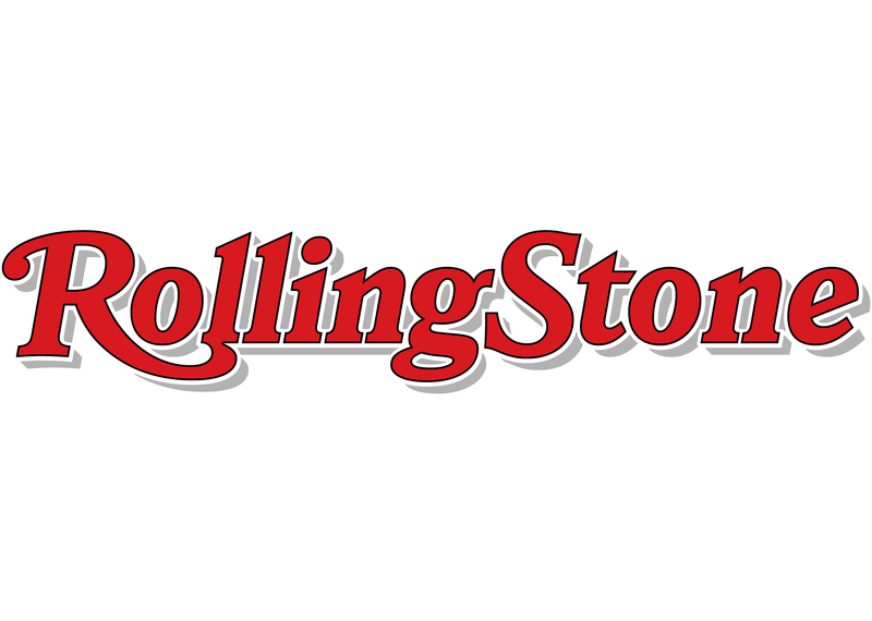
2022: After living with the flat logo for four years, Gus Wenner (Jann’s son, and now CEO of the magazine) and Joe felt the visual identity had lost its signature audacity when the letterforms lost their depth. Because the magazine often uses dramatic photography that partially covers up the logo itself, the brand of the magazine had gotten muted. And the one-color lettering often necessitated a drop shadow to stand out on a busy background.
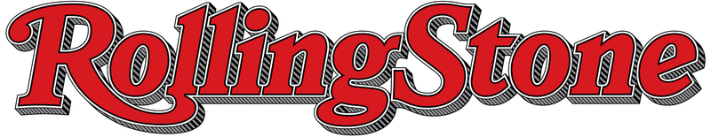
The new logo, designed by Jesse Ragan
But they quickly identified a problem: simply returning to the magazine’s complex earlier logo would be a step backward. Its fine details clog up and become illegible at small sizes, especially onscreen. And the 1981 version looked strikingly dated compared to Jim’s recent modernization of the underlying lettering. Rolling Stone needed a logo that would speak to its legacy and embrace the growing success of its digital platforms, with solid footing for 2022 and beyond.
The planned launch of a new website was the perfect anchor for the update. After 50 years of drawing logos—three of them for Rolling Stone—Jim Parkinson had retired. So Joe called on Roger Black to revisit the publication that had helped make his name as an art director, and Type Network in turn partnered with us for custom lettering design by Jesse Ragan.
Incorporating strengths of the 1977 logo
Incorporating strengths of the 1981 logo
Incorporating strengths of the 2018 logo
Roger is a storyteller at heart, so his long connection to Rolling Stone set the tone for this project. For him, visual design is rolled into one with a history of colorful characters, outrageous lives, and industry intrigue. His presence in our meetings rooted me in the larger context of the work we were doing.
Jesse Ragan
Carrying the legacy forward
To approach this challenge, we absorbed as much as we could from all of the previous iterations of the logo, picking and choosing what worked, to synthesize them into a complex solution that meets the wide-ranging modern needs of the publication. This pivotal moment of change called for all hands on deck for a thoughtful ideation phase. Jesse shared a wide range of concepts with Joe and Roger, checking in periodically with CEO Gus Wenner and editor in chief Noah Shachtman. Even Gus’s father Jann, now retired, dropped into one of our exploratory meetings unexpectedly.
Working with a type designer to produce a logomark is a dream experience as a creative director. Jesse Ragan has all the design skills and creativity one might expect from a talented identity designer, plus a treasure trove of technical knowledge and typographic experience to make the logo actually work. We wanted the logo to be perfectly readable and recognizable at all sizes: That’s why we worked with a type designer.
Joe Hutchinson, creative director of Rolling Stone
A system of logos
When it comes to logos, one size doesn’t always fit all. Rolling Stone’s 1981 logo was born to be big, and Jesse knew it would be futile to stand in the way of its complexity when it came to the magazine cover. He recommended a suite of assets to address all the needs Joe identified: a logo with slightly simplified shading for everyday use, a flattened one-color version, a dramatically simplified small-size version, and a set of monograms for use when visual brevity is key.
Structure
Rolling Stone continues to evolve and grow, pushing its serious editorial chops alongside its rock ’n’ roll attitude. That balance needed to be present in the lettering as well.
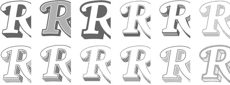
The letterforms in the new logotype pull structural elements from the three previous versions.
After experimenting with a variety of new interpretations for the underlying structure of the lettering, Jesse chose to feature several aspects of the previous logotypes to convey the heritage of the brand. He kept the crisp serifs and confident S from 2018, but reinstated 1981’s strong ball terminal on the R, as well as 1977’s simplified e. The letterforms no longer overlap, and he also traded in the freewheeling wobble of the g for a more stable typographic structure.
Jesse drew sketches over the previous logo as he reconsidered the wordmark’s underlying structure.
Initial sketches explored simplifying the mark’s dimensionality. Some of the resulting ideas were put to use for the small-size version.
Ornament
Perhaps most important and visually obvious, Jesse meticulously reconstructed the intricate shading structure from the 1981 logo—which had never been redrafted in digital form. This was a labor of love for the work of Jim Parkinson, dissecting and reverse-engineering his logic for the placement of facets, lines, and transitions.
The new shading is adapted from the 1981 logotype.
Although the new shadow doesn’t extend as far, and other details of the shading have been simplified, the soul of its earlier incarnation lives on. Jesse focused on finding the right balance of “windows” that would allow the dramatic cover photography to show through the openings in the letterforms without hindering legibility.
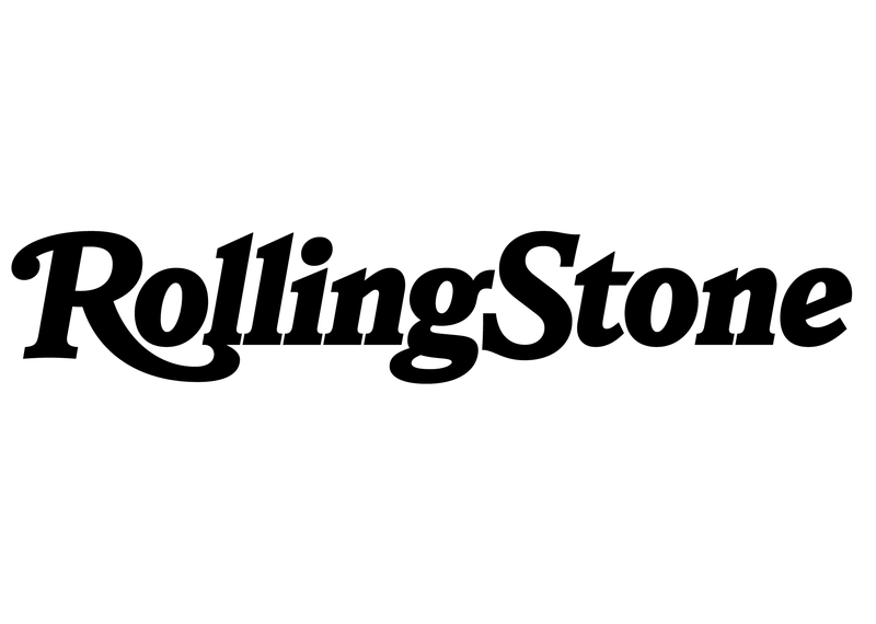
Small size
There’s just no way to make such detailed shading work at a tiny size onscreen. So for a small-size version of the main wordmark, Jesse added more letterspacing and carefully simplified the dimensionality to an abstract shadow. It stays crisp and clear when scaled down to small sizes, but looks identical to the primary logo at a glance.
The new primary logotype looks fantastic on a magazine cover, but it doesn’t work at small sizes.
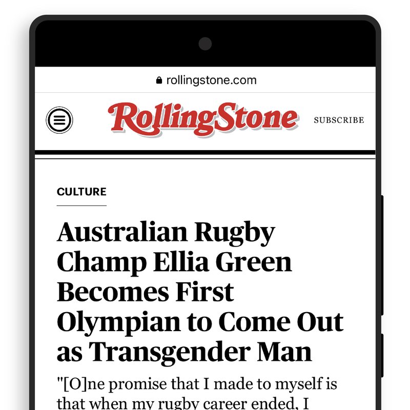
The new small-size logo is optimized to stay crisp and clear when used at tiny sizes onscreen.
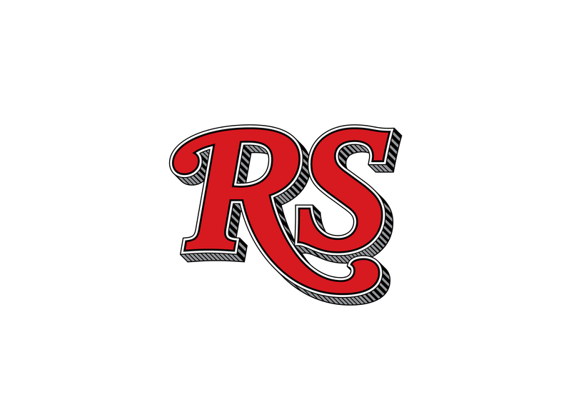
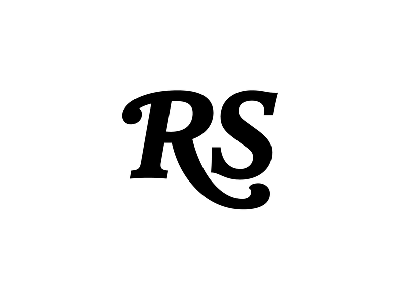
Monogram
More than an afterthought, the “RS” monogram is a major touchpoint for the brand, to be used for the app icon, social media avatars, recommended products, and more. Matching a pair of capitals to the full logo, however, was a challenge. With some experimentation, Jesse arrived at a unique swash descender for R that tightly grips the S, referencing—but not replicating—one of the logo’s signature moves: its unorthodox connection between R and l. Especially when the shading is applied, this mark could say nothing other than Rolling Stone.
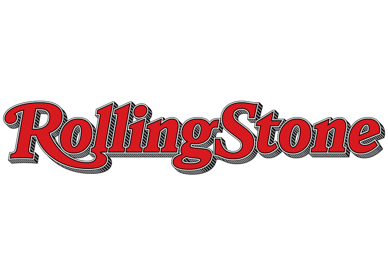
The new Rolling Stone logotype, primary version
The new Rolling Stone logotype, simplified version
The new Rolling Stone logotype, small-size version
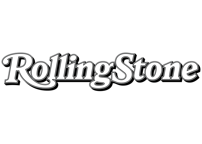
The new Rolling Stone logotype, flat version
The new Rolling Stone monogram, primary version
The new Rolling Stone monogram, flat version
The new suite of Rolling Stone logo assets
With a great 55-year history, the Rolling Stone visual brand has a lot of equity. The assignment here was to carefully move the logo to better align it with the tradition. Jesse Ragan has done that, bringing back the engraved drop shadow from 1967. And he has truly improved on the basic letterforms, while somehow making it look like it’s always been this way. I think it’s the best logo yet. Certainly good for another 55 years.
Roger Black, art director of Rolling Stone (1976–1978) and chair of Type Network
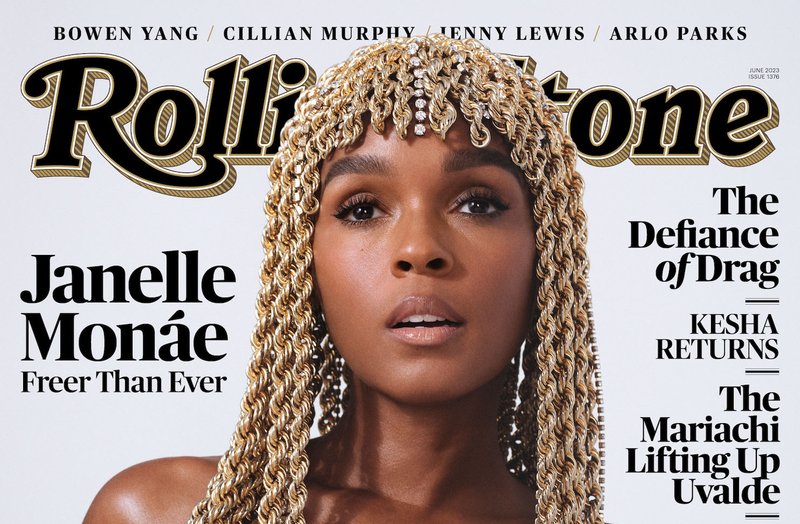
The June 2023 print edition of Rolling Stone, featuring the new logo (and Janelle Monáe)
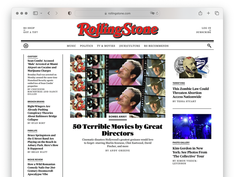
The new small logotype is used dynamically on the website.
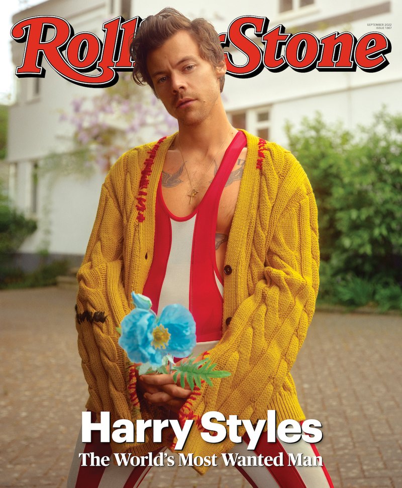
The September 2022 print edition of Rolling Stone, featuring the new logo (and Harry Styles)
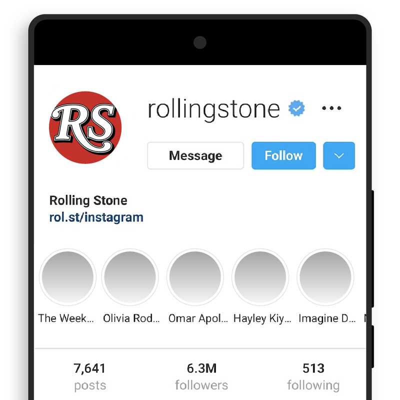
The new monogram is optimized for social media.
A part of history
This is the work we love doing. The opportunity to have our lettering grace the cover of Rolling Stone will never not blow our minds. We are honored that our hand can be invisible, merging seamlessly into the tapestry of this storied publication’s growth and change for the future. In the end, what type designer can ever expect to be a part of rock ’n’ roll history? (Aside from Jim Parkinson, that is.)
The real value here is in appreciating how pleasing and perfectly executed every decision made is. Every letter—and there are so many letters—is now better defined, better spaced, and better constructed with flairs in just the right amount of places... So, overall, a flawless evolution.