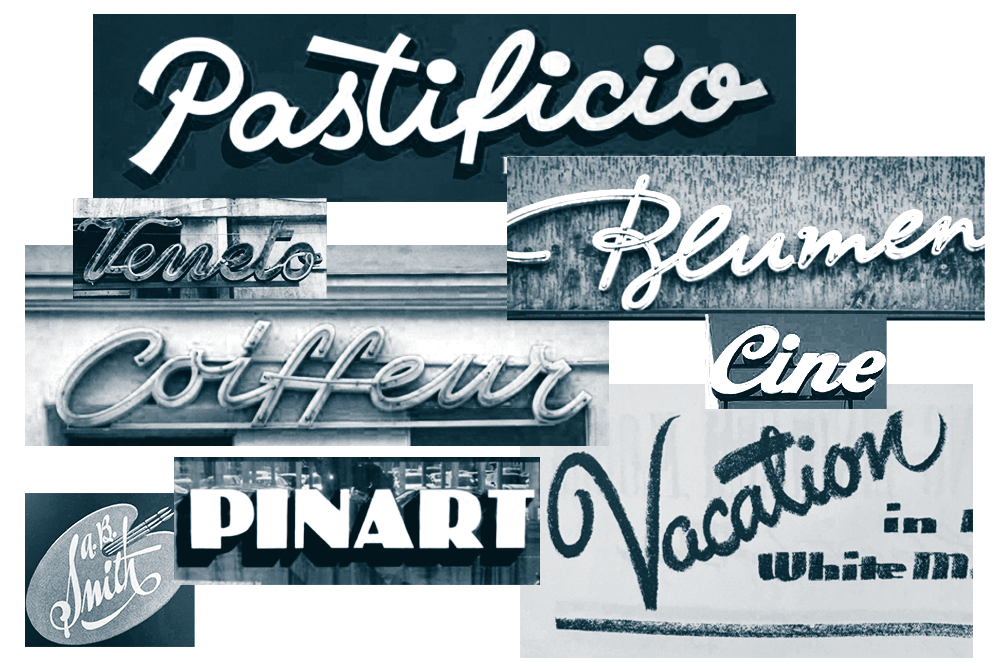
Custom lettering
We extend your design team’s capabilities to create or modify a wordmark for a contemporary visual landscape without losing a brand’s heritage.
Our collaborative process
Here’s an idea of what to expect when you collaborate with us on custom lettering.
Research and landscape audit
We start with intake sessions to understand your needs, past work, and documentation, and assess your position in the industry to uncover opportunities.
Workshops
As needed, we hold workshops with your team to explore design directions and align on visual themes and next steps.
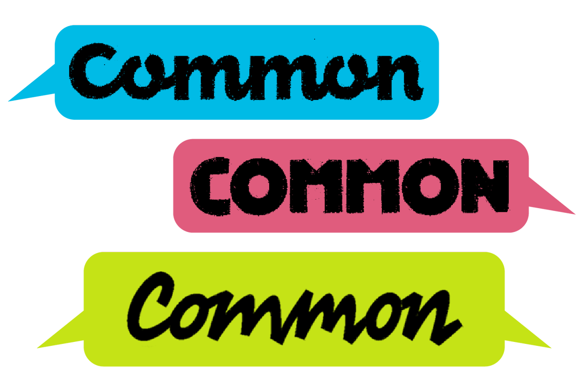
Initial sketches and concepts
Drawing from our research, our early sketches spark discussion and build consensus around a strong design direction.
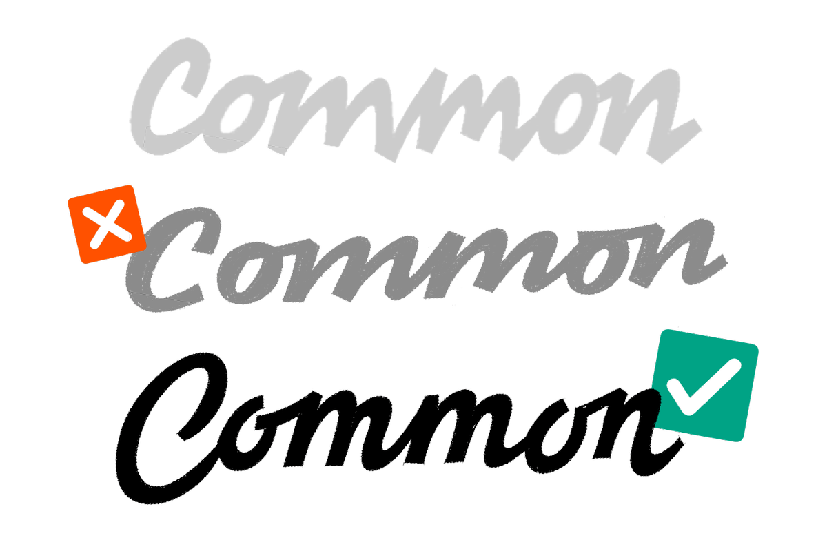
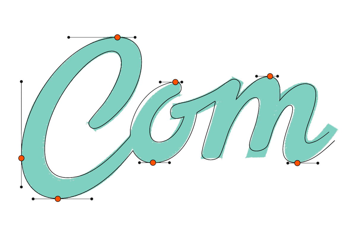
Revision and finalization
We work with you to decide how many revision rounds fit your timeline and availability, and deliver a polished wordmark that’s legible, accessible, and recognizable.
The value of custom lettering
XYZ Type was instrumental in helping us revive the brand of a storied Brooklyn establishment. Their historical type knowledge, attention to detail, and craft are as good as it gets.
Hamish Smyth, partner, Order
Brand relevance
We design lettering that bridges your brand’s past with what your audience expects today, keeping you recognizable and relatable.
Expanded design capability
The skill set required to execute custom lettering is rarely retained in-house. We can fill this gap by becoming temporary members of your creative team.
Digital accessibility
Responsive design and accessibility requirements create important consequences for lettering. We help our clients navigate these challenges and develop lettering that’s legible, accessible, and distinctive at various sizes across platforms.
Custom lettering case studies
Our contemporary reinterpretation of a venerable publication’s iconic nameplate includes a robust library of logotype versions.
In this collaboration with Champions Design, structural steel inspires a monogram for New York City's famous 130-year-old musical institution.
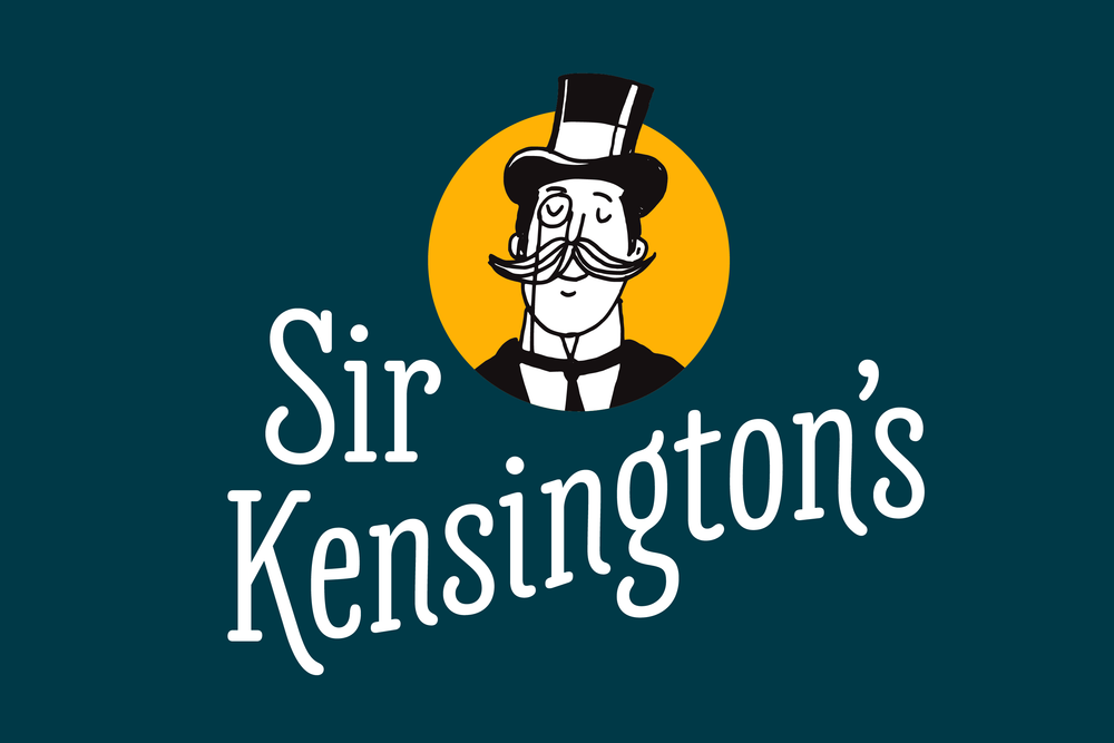
We transform a concept by the in-house design team at a condiment company into a lively logotype that holds up on a mustard packet.
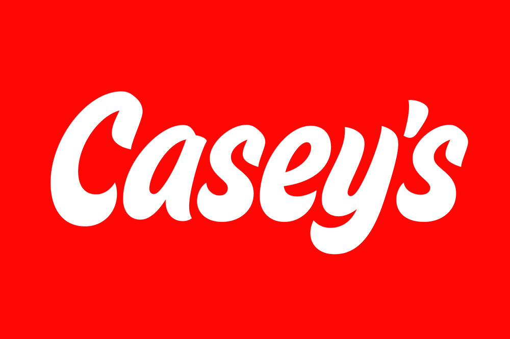
Interbrand’s request to fix a troublesome apostrophe results in an iconic logo now seen on signage and print material at 2,000 locations across the US.
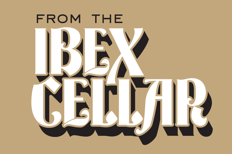
For a Missouri-based brewery, history comes to life through custom lettering inspired by a 19th-century typeface designed in St. Louis.
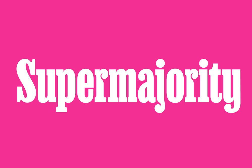
For an organization promoting women's equality, Champions Design requests clever compression of a typeface so that a long name can scale to epic heights.
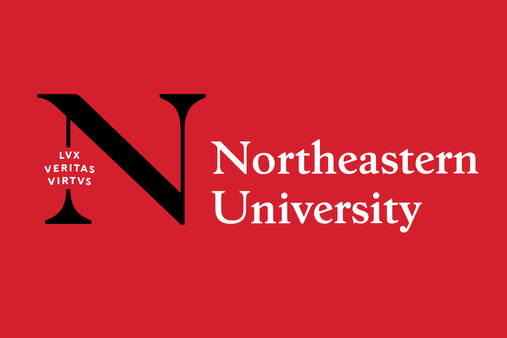
We extend the capabilities of Boston-based studio Upstatement, developing custom lettering and type integral to their identity system for the growing university.
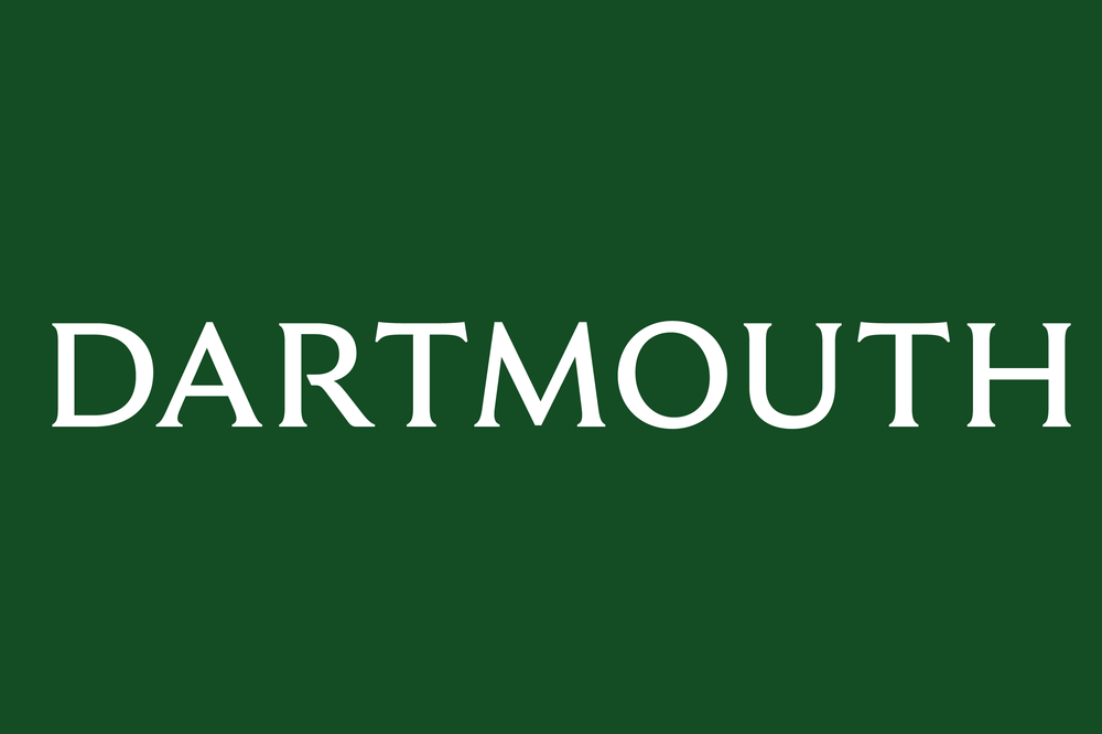
Our passion project celebrating a favorite typeface designer finds its perfect home in Champions Design’s updated identity system for this prestigious university.
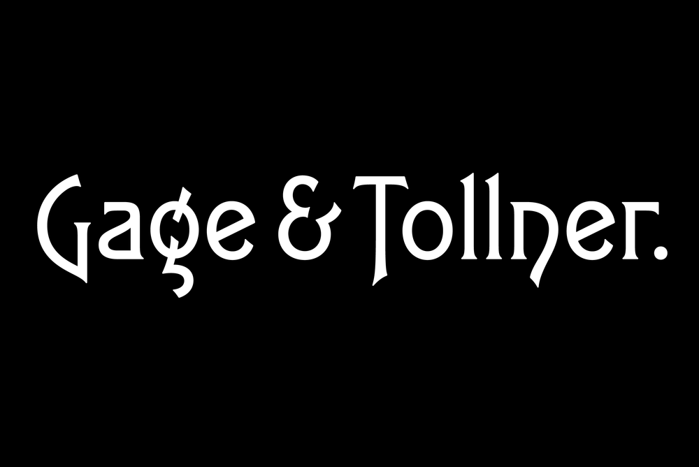
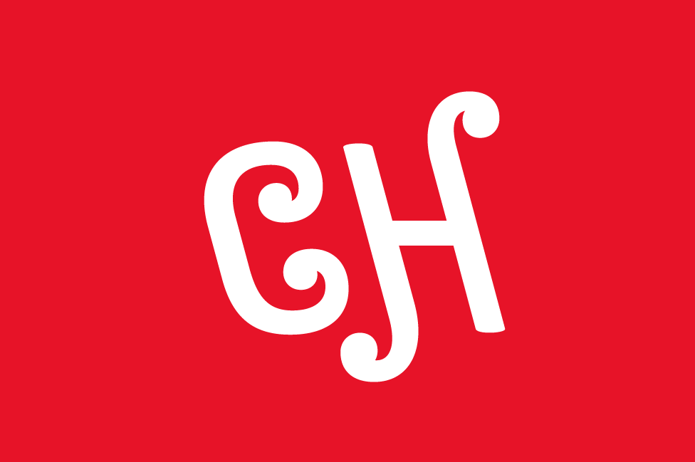
A historic Brooklyn restaurant comes back to life with a wordmark based on the typeface they used for over a century.
We’d love to help with your lettering—email us to discuss.